In today’s digital-first world, having a responsive web design isn’t just a luxury—it’s a necessity. With more users accessing websites on mobile devices than ever before, businesses that don’t prioritize website responsiveness are already falling behind. Whether you’re building a site from scratch or updating an old one, a mobile-friendly approach is critical to deliver great UX design and stay ahead of the competition.
What is Responsive Web Design?
Responsive web design is a web development approach that ensures your website automatically adjusts to different screen sizes and devices—whether it’s a smartphone, tablet, or desktop. Instead of building separate versions of your site for different platforms, responsive design allows your content to scale, shift, and adapt based on screen resolution.
Key Features of Responsive Web Design:
- Fluid grid layouts that resize content dynamically
- Flexible images and media that adjust to device dimensions
- Media queries in CSS for conditional styling
- Seamless navigation and UI across all devices
The goal? To deliver an optimal viewing experience—easy reading and navigation with minimal resizing, panning, or scrolling—across all devices.
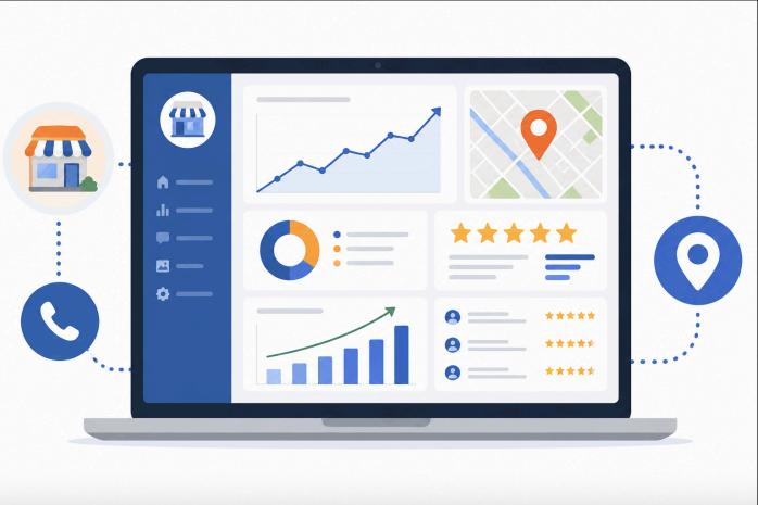
Why Mobile-Friendly Websites Are Essential
According to recent studies, over 60% of web traffic comes from mobile devices. If your website isn’t mobile-optimized, you risk frustrating visitors, losing leads, and dropping in search rankings.
Here’s why mobile-friendly websites matter:
- Improved User Experience (UX Design): Mobile users expect fast, intuitive browsing. If your site takes too long to load or requires zooming and horizontal scrolling, users will bounce quickly.
- Better Search Engine Rankings: Google uses mobile-first indexing, meaning it primarily uses the mobile version of the content for ranking and indexing.
- Increased Conversions: A responsive, user-centric website design builds trust and reduces friction in the user journey, leading to more sign-ups, purchases, and contact form submissions.
Pro Tip: A mobile-friendly website isn’t just about shrinking content—it’s about optimizing layout, functionality, and user intent across every device.
How Responsive Web Design Impacts UX Design
Great UX design starts with understanding the user. Responsive design plays a massive role in ensuring that visitors can interact with your site smoothly, regardless of how they access it.
Benefits of combining responsive design with UX best practices:
- Consistency Across Devices: Uniform design elements lead to familiarity and trust.
- Faster Load Times: Optimized code and adaptive media improve performance, which users (and Google) love.
- Accessibility: Responsive design supports accessibility standards, allowing more users to engage with your content effectively.
If users find your website difficult to use on their device, they’re less likely to stick around—or come back. A responsive UX-driven website ensures they have a pleasant, efficient experience every time.
Best Practices for Implementing Responsive Web Design
Looking to improve your website’s responsiveness? Here are some practical steps you can take:
Start with Mobile-First Design: Design the mobile version first, then scale up for tablets and desktops.
Use Flexible Layouts and Grids: Tools like CSS Flexbox or Grid are ideal for dynamic content structuring.
Optimize Images and Media: Use SVGs or responsive image formats that resize based on screen size.
Test on Multiple Devices: Emulators help, but real-device testing reveals true user experience.
Leverage Responsive Frameworks: Bootstrap and Foundation are powerful tools to fast-track responsiveness.
Need help with implementation? Our web design services specialize in building fully responsive, high-converting websites tailored for modern users.
Real Business Results from Responsive Design
Brands that invest in responsive web design often see:
- Higher mobile conversion rates
- Lower bounce rates
- Increased page views per session
- Improved engagement across devices
If your current site isn’t performing, chances are, it’s not truly responsive.
Conclusion: Responsive Web Design is No Longer Optional
In an age where attention spans are short and mobile usage is booming, responsive web design is the backbone of digital success. From delivering seamless UX design to ensuring mobile compatibility, responsiveness is at the heart of every high-performing website.
If you want to attract, engage, and convert users effectively, your site must be fast, fluid, and functional—on every screen.
Ready to Upgrade Your Website?
Don’t let outdated design hold you back. If you’re ready to create a mobile-friendly website that delivers exceptional User Experience and adapts beautifully to any device, get in touch today and let’s bring your vision to life.
Frequently Asked Questions
- How is digital printing different from traditional (offset) printing?
Unlike traditional offset printing, digital printing eliminates the need for plates and complex setup. This reduces setup time, lowers costs for short runs, and allows on‑demand printing with fast turnaround.
- What are the main benefits of digital printing for businesses?
- Fast turnaround times
- Cost‑effective for small and medium print jobs
- Personalized printing through variable data printing (VDP)
- High‑quality output and flexibility across applications.
- Can digital printing handle customized or one‑off printing jobs?
Yes — digital printing is ideal for customized, one‑off, or short‑run jobs. Variable data printing enables personalization of each print item, which is perfect for direct mail, personalized marketing materials, or unique packaging.
- Is digital printing more eco‑friendly than traditional printing?
Generally, yes. Digital printing reduces waste by eliminating plates and allows on‑demand production that helps decrease excess inventory. It also lowers energy use because it doesn’t require extensive setup processes.
- What types of products can be made with digital printing?
Digital printing can be used for:
- Marketing materials (brochures, flyers, business cards)
- Packaging and labels
- Textiles and apparel
- Signage and banners
- Promotional items and custom products.
- How has digital printing technology evolved over time?
Digital printing started with early inkjet and laser printers and has since advanced to high‑speed, high‑quality presses with rich color output, better resolution, and faster production. Technologies like digital offset printing combine digital file advantages with traditional high‑quality presses.
- Is digital printing suitable for large volume orders?
While digital printing can handle many applications, very large volume jobs may still be more cost‑effective with traditional offset printing due to per‑unit cost differences at scale. However, advances in digital tech are closing this gap